It is trivial that population growth and economic growth are (strongly) correlated. We wanted to reconfirm this relationship with actual data and also analyze the more crucial question how population growth and per capita economic growth are related.
Results significantly depend on the choice of countries and reference period (for measuring economic growth and population growth).
We decided to use the data from the Credit Suisse's research Institute, namely the Credit Suisse Global Investment Returns Yearbook 2014 (actually panning a second post to verify Piketty´s r>g claims).
Credit Suisse data is for the period 1900-2013 and itself based on Maddison (which we had previously used). Obviously there is significant uncertainty with regard to concept of economic growth in the early part of the 20th century (Kuznets' initial calculation for the US were made in 1937).
The data for the 21 countries in the data set looks as follows:
And the followoing correlation matrix confirms:
- positive correlation between population growth and GDP growth (correlation coefficient of 0.65)
- negative correlation between population growth and GDP growth per capita (correlation coefficient of -0.45)
Usual caveat: correlation is not causation and if there is causation we don't which way the causation runs
Nevertheless, the results seem to explain why elites favor population growth while the population is more ambivalent.
Copper prices are believed to be a leading indicator of economic health. We endeavour to verify this hypothesis through quantitative analysis thereby also focussing on the economies of Chile (principal producer) and China (principal consumer). We do believe in mean reversion although we acknowledge that imbalances can persist for very long times and that market structures can change permanently.
Tuesday, March 25, 2014
Monday, March 10, 2014
World´s Smartest Cities
The IESE publishes an annual ranking of the world´s smartest cities. Here are the top 10 cities with their respective ranks in 2011, 2012 and 2013. Tokyo, London and New York are top 3. Switzerland has 3, Japan 2 countries in the top 10. Santiago de Chile is only ranked #83 (although ranked first in Latin America).
Tuesday, February 25, 2014
Supercomputer Ranking and Density
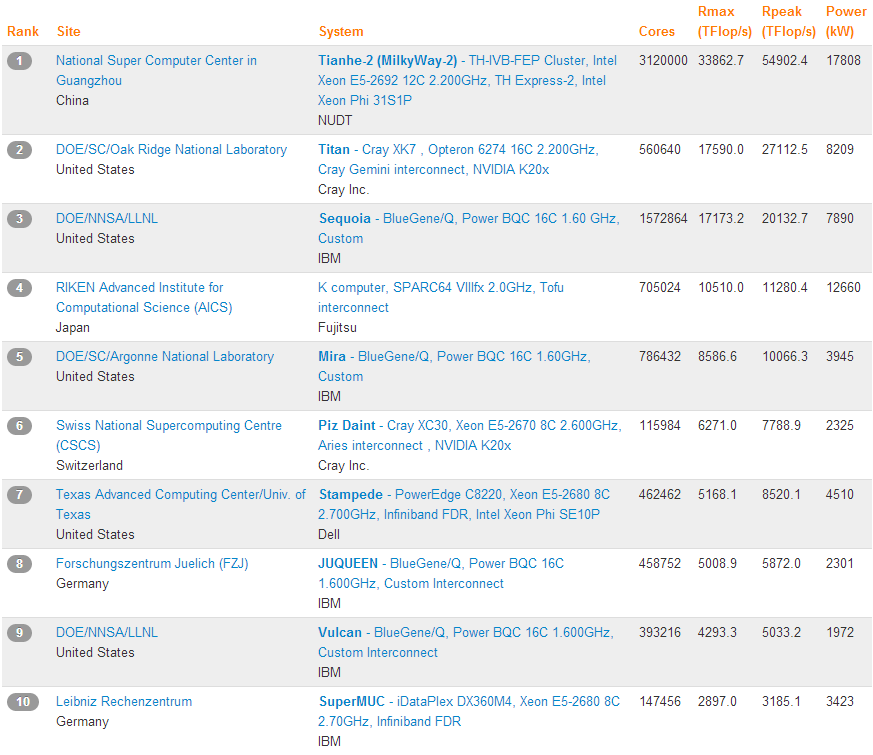
Top 500 Supercomputer Sites publishes a cool overview of the 500 most powerful (measured in Terra Flops) worldwide.
Here are the top 10 with five computers from the US, two from Germany and one each from China, Japan and Switzerland.
Looking at the whole list (500 super computers) the country distribution is as follows with the US dominating followed by China and Japan.
An a per capita basis, the US is still leading followed by Switzerland and Norway. The relatively low density of Germany and Japan may be surprising.
Here are the top 10 with five computers from the US, two from Germany and one each from China, Japan and Switzerland.
Looking at the whole list (500 super computers) the country distribution is as follows with the US dominating followed by China and Japan.
An a per capita basis, the US is still leading followed by Switzerland and Norway. The relatively low density of Germany and Japan may be surprising.
Monday, February 10, 2014
Patent Registration by Latin American Inventors and Applicants
The European Patent Office allows to search patent filing by a number of criteria, including country of inventor and applicant, publication data and classification (the search is for worldwide patent offices).
The following provides ans overview of Latin American (plus Jamaica, Trinidad & Tobago, French Guiana, Guayana and Suriname) countries in comparison with Spain and Portugal. Both the absolute number of filings and the filings per capita are shown (the data is shown for 2013 and the criteria was that at least one of the applicants and one of the inventors came from the respective country):
The leading country is Uruguay followed by Chile and Trinidad & Tobago. Compared to Portugal and especially Spain, there is still significant catching-up to do in Latin America (noting the Portugal and Spain also have a relatively low patent rate compared to the leading countries). The same information is shown graphically:
For Chile the development since 1990 has been as follows (significant increase since around 2000):
In terms of categories the distribution is as follows:
The following provides ans overview of Latin American (plus Jamaica, Trinidad & Tobago, French Guiana, Guayana and Suriname) countries in comparison with Spain and Portugal. Both the absolute number of filings and the filings per capita are shown (the data is shown for 2013 and the criteria was that at least one of the applicants and one of the inventors came from the respective country):
The leading country is Uruguay followed by Chile and Trinidad & Tobago. Compared to Portugal and especially Spain, there is still significant catching-up to do in Latin America (noting the Portugal and Spain also have a relatively low patent rate compared to the leading countries). The same information is shown graphically:
For Chile the development since 1990 has been as follows (significant increase since around 2000):
In terms of categories the distribution is as follows:
Saturday, January 25, 2014
Luxury Car Density (2014 Update)
The following provides an update to an analysis we made in 2012, looking at the luxury car density across countries, posted here and here.
Again we looked at the number of listings on the OOYYO Network. This time we reduced the brands included only six main brands from Italy (Ferrari, Lamborghini and Maserati) and UK (Aston Martin, Bentley and Rolls Royce).
The density calculated as the listings on the site for the referenced brands divided by the total listings looks as follows (see map and table). The observations made in 2012 are repeated:
Again we looked at the number of listings on the OOYYO Network. This time we reduced the brands included only six main brands from Italy (Ferrari, Lamborghini and Maserati) and UK (Aston Martin, Bentley and Rolls Royce).
The density calculated as the listings on the site for the referenced brands divided by the total listings looks as follows (see map and table). The observations made in 2012 are repeated:
- very high densities for Luxembourg, Switzerland and Singapore
- high rates for UK and Italy
- medium-high rates for Western Europe, Sweden and Canada
- medium-low rates for Scandinavia (ex Sweden), US, Australia and New Zealand
Outliers include Lithuania, Malaysia, Slovakia and Nigeria. Note the some of these outliers might be driven by the fact that the density relative to all offered car is shown (and not per capita).
Without further comments, the map looks as follows:
And here the data table:
Friday, January 10, 2014
Preferred Podcasts
The following provides an overview of my favourite podcast (in English and German):
- Common Sense with Dan Carlin (US)
- Dan Carlin's Hardcore History (US)
- BBC Documentaries (UK)
- SRF Echo der Zeit (Switzerland)
- Economist: Editor's Pick (UK)
- EconTalk (US)
- SRF International (Switzerland)
- BBC More or Less: Behind the Stats (UK)
- Nature Podcast (UK)
- NPR Planet Money (US)
- NPR TED Radio Hour (US)
- SFR Trend (Switzerland)
- FT World Weekly (UK)
So far I have not encountered a podcast in Italian, Spanish or French which I found worth listening too (only referring to languages I would be able to understand).
Wednesday, December 25, 2013
Voter Turnout Chile - 2013 Update
We had covered in a previous post the development of voter turnout in Chile since 1870. In this post we update the time series to include the recent elections.
First we have update the population time series from INE and calculated the voting age population as 40% of the 15-19 age band plus all the age band 20+. The result is graphically depicted as follows:

The ratio of the voting age population as a percentage of total population has increased from 64% in 1990 to 74% in 2013 and is expected to further increase at a somewhat reduced pace to 76% in 2020. It should be noted that the voting age population is not identical with the population permitted to vote as some segment of the voting age population (foreigner with less than five year of residency, persons with criminal records of certain characteristics etc) are not allowed to vote.
Separately, it is well known that the Servel voting registry is inflated and that the Census data contradicts the INE projection. We will come back to this in a future post.
Below updated table of (i) population, (ii) voting age population, (iii) votes and (iv) valid votes since 1870. The sources have all been disclosed in the earlier post.

And the voter turnout in graphical format.
Especially the first round of the presidential election seems to be in line with the previous compulsory voting record.
First we have update the population time series from INE and calculated the voting age population as 40% of the 15-19 age band plus all the age band 20+. The result is graphically depicted as follows:

The ratio of the voting age population as a percentage of total population has increased from 64% in 1990 to 74% in 2013 and is expected to further increase at a somewhat reduced pace to 76% in 2020. It should be noted that the voting age population is not identical with the population permitted to vote as some segment of the voting age population (foreigner with less than five year of residency, persons with criminal records of certain characteristics etc) are not allowed to vote.
Separately, it is well known that the Servel voting registry is inflated and that the Census data contradicts the INE projection. We will come back to this in a future post.
Below updated table of (i) population, (ii) voting age population, (iii) votes and (iv) valid votes since 1870. The sources have all been disclosed in the earlier post.

And the voter turnout in graphical format.
Especially the first round of the presidential election seems to be in line with the previous compulsory voting record.
Tuesday, December 10, 2013
Impact of 1930´s depression on Chile´s Economy
Just re-read a chapter of Reinhart & Rogoff´s "This Time is Different: Eight Centuries of Financial Folly" (obviously I´m aware of the calculation errors, in my view it is still a tremendously valuable book).
The following graph (on page 267) describes the collapse of exports 1929 -1932. From a Chilean perspective the magnitude of the drop is particularly impressive.
Sunday, November 10, 2013
Male/Female Ratio for Major Countries
For major countries, the total population and the male/female ratio has been obtained from UN´s: World Population Prospects: The 2012 Revision (dated 2013)
Major countries has been somewhat arbitrarily defined as:
- G20 member
- OECD member above 5 million population
- UN member abover 50 million
Graphically depicted this look as follows (red female surplus, blue make surplus):
The corresponding data in table format:
Major countries has been somewhat arbitrarily defined as:
- G20 member
- OECD member above 5 million population
- UN member abover 50 million
Graphically depicted this look as follows (red female surplus, blue make surplus):
Friday, October 25, 2013
Copper Aluminium Price Ratio
We had looked at the copper to aluminium price ratio earlier and noted that it had reached a historical maximum. Interestingly the price ratio has more or less less stayed above 4 and recently even moved to 4.3 as can be seen in the following graph. The data has been obtained from OFDP (Open Financial Data Project).
Admittedly, this price development has not been in line with our expectations.
Subscribe to:
Posts (Atom)