I have now expanded the the GGDC/Maddison dataset filling the missing datapoints for GDP. The assumption was for constant per capita growth rate for each individual country for the known GDP data point for the start and end date and known population data points for each year between the start and end date.
As already mentioned in a
previous GDP per capita post:
GDP data is expressed in 1990 Geary-Khamis dollars, see also UN Statistics Division definition. Obviously historical GDP data is fraught with uncertainty both as a result of data availability and methodological issues (I'm not really a fan of PPP adjustments). Also some of the countries didn't exist or territories changed during the 1820 - 2008 period. Therefore, the data is based on today's frontiers.
Without further comment, a graphical representation of the data:
WWI, the 1930's depression, WWII and 1980's the stagnation are clearly visible. As the y-axis is shown in logarithmic format, obviously a constant growth rate would show-up as a straight line. The highest growth rates have been in the 1950's, 1960's and 2000's as can also be seen in the next chart additionally showing population growth and GDP growth (GDP per capita data as above in green).
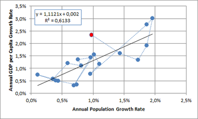
Next, I looked at GDP per capita growth relative to population growth. Given that GDP per capita has already eliminated the population element, I would have expected independence between the two time series. This doesn't seem to be the case (each point on the graph represents a decade, the 2000's are shown in red):
I would offer the following non-exclusive choice of alternative explanations:
- the data is flawed
- the is no causality
- the relationship has broken down (or possibly reversed as shown by the last three data points) as a larger share of the world population has obtained middle income status
- population growth is dependent on gdp per capita growth with a lag (and the lag is masked when looking at decadal data)
- most worringly when looking at the future potential for GDP per capita growth, GDP per capita growth is indeed dependent on population growth
When looking at the annual time series since 1950, indeed it seems that there is no correlation (2008 shown in red), although this also doesn't necessarily imply that there is no causality:
Data is
here.


.png)