Tuesday, September 25, 2012

Copper Substitution by Aluminium

In previous posts we have looked at the relative conductivity of Copper and Aluminium and at their price ratio time series. Both suggested that copper substitution with aluminium is expected to take place.

It is interesting to hear what major copper and aluminium producers have to say about copper to aluminium substitution.


From BHP Billiton ("copper remains a material of choice", "overall substitution remains small", "substitution has not significantly increased penetration"):


From Hydro ("copper substitution represents major potential", "aluminium has almost replaced copper in automotive precision tubing over last 30 years", "the leading position of copper in buildings has remained unchallenged ... until now"):


This is what DB has to say (presented at an ICSG meeting in April 2012) speaking from a copper industry point of view:


Black Rock's Cathrine Raw believes that substitution has already occurred:

“It’s now been fully substituted on the demand side. We’ve seen high copper prices for the past five years, and so in terms of substituting it for aluminum, all of that has occurred already. So unless there is a significant technological change on the demand side, there isn’t really a demand destruction you would expect if prices do raise.
Reuters echoed a similar narrative in their August 2011 article: "Copper's green appeal shields against substitution".

Bloomberg Businessweek provides a balanced view of opinions in their February 2012 article: "Aluminium over copper for cables helps Rusal, Alcoa", citing both substitution bullish voices (such as Rusal and Alcoa) and substitution bearish opinions (such as the above cited ICSG/DB presentation). However, we disagree with the following paragraph:


Copper is at least 65 percent more effective than aluminum in three key properties: electrical conductivity, thermal conductivity and ductility, according to Deutsche Bank. This implies that copper should cost 1.65 times more than aluminum. When that ratio climbs to 2-to-1, an economic incentive to substitute copper with aluminum arises, according to the bank.

Conductivity is a dimensional property while prices are quoted per weight unit. This means that for a cable of the same size (say 1 km length, 1 cm diameter), the copper cable has indeed a 65% higher conductivity compared to aluminium. However, for a copper cable of the same weight, the conductivity for the aluminium cable is almost twice the value of the copper cable (copper's specific weight is more than three times higher than aluminium's specific weight). This implies that purely from a conductivity perspective the price ratio floor would be 0.5 rather than 1.65, although without any doubt other characteristics play an equally important role (ductability, fire resistancy, oxidation etc), so for the last 60 years the price ratio floor was around one.

Street Authority's Nathan Slaughter states in his July 2012 article "one of the biggest opportunities in commodities since 1997" that

with aluminum rapidly replacing more and more copper every year, I believe prices will converge not by copper falling, but by aluminum rising. And there are several other factors at play that point to the exact same conclusion.
Groven and Partners also shares the opinion in their July 2012 post "a copper caper" that substitution will play a role, but sees convergence of the copper aluminium price ratio through lower copper prices rather than higher aluminium prices.

Our basic idea is that the copper market is vulnerable because of (i) economic shocks from macro headwinds, (ii) substitution effects, (iii) a widespread and misplaced belief in Peak copper and (iii) structural changes in the copper market (financialization effects) that exaggerate demand.
We also share the view Peak Copper is not an issue at the moment (i.e. for the next 10 to 20 years).

Finally Goran Djukanovic indicates in an article ("Aluminium versus copper – substitution on the way") in the April 2012 edition of the International Aluminium Journal (pp. 20-23) that:

There is no firm evidence that copper will be replaced by aluminium and alternative materials to an extent that would significantly influence future demand and result in lower prices. The prices of metals and materials (plastics, composites) that replace copper will also rise in future on increased demand, so limiting the extent of substitution and at the same time risking that these materials, in turn, may eventually be replaced.

Monday, September 10, 2012

Luxury Car Ownership per Capita (1 of 2)

Somewhat lighter programming today: a friend recently asked me whether I knew which country had the highest per capita Ferrari ownership. Off course I didn't know and offered a guess that it might be some of the usual suspects including Hong Kong, Singapore, Qatar, UAE, Luxembourg or Switzerland.

Turns out he didn't know either and there are really no good statistics available. So I became interested (in an admittedly rather irrelevant data point). As a first step I decided to make the exercise a little bit broader and included the following brands:

Ferrari I http://www.ferrari.com
Maserati I http://www.maserati.com/
Aston Martin UK http://www.astonmartin.com/
Lamborghini I http://www.lamborghini.com
Bentley UK / D http://www.bentleymotors.com/
Lotus UK http://www.lotuscars.com/
Rolls Royce UK / D http://www.rolls-roycemotorcars.com/
Morgan UK http://www.morgan-motor.co.uk/
Fisker US http://www.fiskerautomotive.com
Wiesmann D http://www.wiesmann.com/
Artega D http://www.artega.de
McLaren UK http://www.mclarenautomotive.com
Tesla US http://www.teslamotors.com/
Bugatti F / D http://www.bugatti.com

I appreciate that the list is somewhat random.

The following two approaches provide at least a a relative indication of car ownership per capita.

  1. Counting car dealership per brand (which is public domain information and available on the above listed sites)
  2. Counting used car offered online for individual national markets (which can be retrieved from used car websites or corresponding aggregators)
This post will focus on the first approach. Plotting the number of luxury car dealerships (per country) against population results in the following (own data compilation).


The car dealership metric is clearly biased towards smaller markets and comparison probably only makes sense for countries of similar population sizes. From smaller to larger population, Monaco, Luxembourg, Qatar, Switzerland, Italy, UK, Germany and USA are at the top of their respective population brackets. Italy, UK and Germany are closely clustered whereby for the first two there is clearly a home market advantage. Singapore, Hong Kong and UAE are in same population bracket as Switzerland but have a much lower number of luxury car dealership (so at least on this one my initial hunch was not confirmed).

For Ferrari the number of dealerships per million population looks as follows (also here eliminating countries with only one dealership to increase the meaningfulness somewhat) with Italy highlighted:


For Aston Martin the number of dealerships per million population looks as follows (also here eliminating countries with only one dealership) with the United Kingdom highlighted:


In one of my next posts, I will look at used car offerings as an an alternative to determine luxury car ownership.

Data can be retrieved here.

Saturday, August 25, 2012

Copper to Aluminium Price Ratio

First the data in graphical format for 12 months (source: Bloomberg), 20 years (source: Bloomberg terminal) and 110 years (source: USGS Copper and Aluminium).


As of 23 August 2012 the ratio stands at 4.08, which is the maximum which has been achieved since the beginning of the time series in 1900. Since 1950 the Cu/Al price ratio has peaked three times (at 1.75 in 1956, at 2.25 in 1973 and at 1.84 in 1991) and then strongly reversed to a price ratio of almost 1.


Typically the reason for the reversion of Cu/Al price ratio is substitution (of Copper usage by Aluminium). Normally this takes time, but there is no fundamental reason, why this will not happen again over the next few years.

In one of our next posts we will look at substitution.

Friday, August 10, 2012

Relative Conductivity for Ag, Al, Au and Cu

The basic conductivity properties (thermal and elctrical) together with its inverse (resistivity) and respective prices and density have been obtained for Silver, Aluminium, Gold and Copper as follows. Note that prices are shown in USD per kg which results in somewhat unfamiliar values.


This results in the following relative conductivity values (Copper=100%). While on a volume adjusted basis, aluminium has about 60% of the conductivity (value may vary slightly as conductivity measurements are experimental and depend on the alloy type) on a weight adjusted basis, Aluminium has about double the conductivity of Copper. Finally on a price adjusted basis Aluminium's conductivity is more than eight times higher.


The situation for electrical conductivity looks very similar.


May be we read to much into the above but given the significant differential it is somewhat surprising that we are not seeing more substitution of copper by aluminium.

Wednesday, July 25, 2012

Top Copper Producing Countries

The following provides an overview of the top 10 copper producing countries, both on an absolute basis and on a per capita basis. The data source for the copper mining production data is the British Geological Survey. The data source for the population data is the GGDC/Maddison data set, the 2010 value was obtained extrapolating the 2008/2009 growth rate to 2010. Copper price was determined at USD 7'000 per ton.

Chile followed by Peru, China, United States and Indonesia are the leading copper production countries, no real surprises in the top 10 list.


On a per capita basis, Chile remains the undisputed top producer, the other countries making the top 5 are Zambia, Peru, Mongolia and Australia.


Once Ivanhoe's Oyu Tolgoi mine becomes operational, Mongolia's per capita copper production may become of the same magnitude (altough probably still somewhat lower) as Chile. More information about Oyu Tolgoi from Ivanhoe, the project site and Wikipedia.

Calculation details are here.

Tuesday, July 10, 2012

GDP per Capita Time Series for Spanish Speaking Countries

Data from GGDC/Maddison, values in 1990 Geary-Khamis dollars.

Comparison of Argentina, Chile, Venezuela and Spain for the 1820 to 2008 period in absolute terms:


  • Argentina was the wealthiest of the four countries from 1820 to 1940 (although Chile and Spain equalized Argentina around 1870) to be surpassed by Venezuela in the early 1950's
  • Chile suffered an almost 40% drop in GDP per capita as a result of the great depression or more specifically low copper prices as a result of it
  • Venezuela didn't have any real per capita growth for the last 60 years (!)
  • Spain overtook its former colonies of Chile, Argentina and Venezuela in 1965, 1975 and 1983 respectively, the current crisis in Spain is not yet reflected in the data but the difference seems to be too big to be bridged even by Chile in the near term
The same information depicted as a percentage of average world GDP per capita. Venezuela and Argentina relative decay in GDP per capita since the 1950's are very visible. Chile is back to its historic levels of around 175% of the world average, but after a impressive recovery from 1985 to 1997 has stagnated on a relative basis since then.


Finally the rank in terms of GDP per capita among the Spanish speaking countries / territories. The country which was top ranked in the 19th century was Uruguay. Currently the bottom country is Nicaragua.


Data is here.

Monday, June 25, 2012

Peak Lithium

Slightly off-topic, but since we had fun with the "peak copper" calculations, here are the same results for Lithium.

Lithium is often referred to as white gold and associated with a very bright future given lithium's use in battery technology. However, the reality is quite modest with Chile being the largest lithium producer (as per USGS representing about a third of global production) earning a mere USD 174 million (annual data from 2010) from lithium exports.

Nevertheless, Lithium production has nicely increased, as the following graphic visualizing the USGS time series shows.


Making the Hubbert linearization plot, you end up with almost constant production rates (as a percentage of cumulative production).


Obviously, Lithium is so early in its production cycle and reserves are so massive that the notion of peak Lithium doesn't make too much sense.

Calculation details are here.

Sunday, June 10, 2012

World Population, GDP and GDP per capita growth 1820 - 2020

I have now expanded the the GGDC/Maddison dataset filling the missing datapoints for GDP. The assumption was for constant per capita growth rate for each individual country for the known GDP data point for the start and end date and known population data points for each year between the start and end date.


As already mentioned in a previous GDP per capita post:
GDP data is expressed in 1990 Geary-Khamis dollars, see also UN Statistics Division definition. Obviously historical GDP data is fraught with uncertainty both as a result of data availability and methodological issues (I'm not really a fan of PPP adjustments). Also some of the countries didn't exist or territories changed during the 1820 - 2008 period. Therefore, the data is based on today's frontiers.
Without further comment, a graphical representation of the data:


WWI, the 1930's depression, WWII and 1980's the stagnation are clearly visible. As the y-axis is shown in logarithmic format, obviously a constant growth rate would show-up as a straight line. The highest growth rates have been in the 1950's, 1960's and 2000's as can also be seen in the next chart additionally showing population growth and GDP growth (GDP per capita data as above in green).


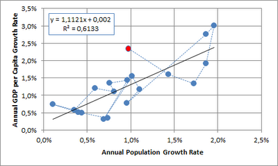
Next, I looked at GDP per capita growth relative to population growth. Given that GDP per capita has already eliminated the population element, I would have expected independence between the two time series. This doesn't seem to be the case (each point on the graph represents a decade, the 2000's are shown in red):


I would offer the following non-exclusive choice of alternative explanations:
  • the data is flawed
  • the is no causality
  • the relationship has broken down (or possibly reversed as shown by the last three data points) as a larger share of the world population has obtained middle income status
  • population growth is dependent on gdp per capita growth with a lag (and the lag is masked when looking at decadal data)
  • most worringly when looking at the future potential for GDP per capita growth, GDP per capita growth is indeed dependent on population growth

When looking at the annual time series since 1950, indeed it seems that there is no correlation (2008 shown in red), although this also doesn't necessarily imply that there is no causality:


Data is here.

Friday, May 25, 2012

Peak Copper

Since copper prices have increased massively starting in 2004, copper peak theories have been suggested.

Although copper is essentially the ultimate renewable resource (and also available quite abundantly in lower grades) the discussion has gained some traction especially following Jean Laherrrère's slide collection, which was reproduced here and  here.

The following provides an update of the Hubbert linearization with data extended to 2011 (based on Hubbert's original 1956 paper on fossil fuels and a Hubbert math summary) and a naive top-down estimate of Qtot.


Based on the above Qmax end up being 4.7 billion tons (whereof approx. 0.6 billion tons have been mined as of 2011). USGS noted the following on world copper resources:
"A 1998 USGS assessment estimated 550 million tons of copper contained in identified and undiscovered resources in the United States. Subsequent USGS reports estimated 1.3 billion tons and 196 million  tons of copper in the Andes Mountains of South America and in Mexico, respectively, contained in identified, mined, and undiscovered resources. A preliminary assessment indicates that global land-based resources exceed 3 billion tons. Deep-sea nodules and submarine massive sulfides are unconventional copper resources."
Reserves are estimated at 0.55 billion tons. Note below reserve and resource definitions from USGS.
"Reserve: That part of an identified resource that meets specified minimum physical and chemical criteria related to current mining and production practices, including those for grade, quality, thickness, and depth."
"Resource: A concentration of naturally occurring solid, liquid, or gaseous material in or on the Earth’s crust in such form and amount that economic extraction of a commodity from the concentration is currently or potentially feasible."
Although copper production data doesn't really lend itself to Hubbert linearization, the Qmax of 4.7 billion tons is broadly in line with USGS's resource estimate (which excludes already mined mineral).

There have been suggestions to use alternative periods for the fit of Hubbert linearization. Results are summarized below:


It seems that the year of peak primary production is somewhere between 2030 and 2070, probably after 2050. From this perspective (admittedly a somewhat naive view from 10'000 m altitude), it would seem that the peak copper narrative is not so relevant.

We aim to address two aspects providing additional support to the above from separate angles in future posts:

  • Relative prices of energy and copper (energy as a key input factor to copper production cost and copper as a key input factor for renewable energy production cost)
  • Recycling / secondary production

Thursday, May 10, 2012

World Population Data 1820 - 2008

I have now expanded the the GGDC/Maddison dataset filling the missing datapoints using the same growth pattern as neighboring countries. Obviously this exercise should be taken with a grain of salt as the additional data points are not based on original research.

Population (in 000) and decadal population growth for Western Europe, Western Offshoots, Eastern Europe & FSU and Latin America.


Population (in 000) and decadal population growth for China/Hong Komg/Taiwan, Pakistan/India/Bangladesh, Rest of Asia and Africa.


Source data is here.