Tuesday, December 25, 2012

Copper Inventories with Producers

For the last two years the off-exchange copper inventory in China has been an important item when evaluating the copper market. While the anecdotal evidence has been strong, it has proven extremely difficult to come up with meaningful hard data. Nevertheless, a number of blogs particularly FT Alphaville have provided significant insight:


We would like to add one additional piece to the puzzle by looking at producers inventory, particularly Codelco, the largest copper producer worldwide. While Codelco is not a publicly listed company, commendably it makes its quarterly reports reports available in the public domain.

We went through the the financial reports and focused on two metrics: inventory and revenues. We understand that inventory is broader than finished products. Nevertheless the ratio between inventory and revenues (inventory expressed in months of production) is very revealing:


The last data point is for the quarter ending on September 30, 2012. We view it to be quite interesting that the two previous episodes with the inventory exceeding 2 months of production were (i) in 2003 with copper prices below USD 2'000 per ton and (ii) in early 2009 with copper prices falling below USD 4'000. At the moment the (relatively) high inventory levels have not resulted in any price reaction.

We would also like to point out to some interesting movement in copper data as jsut published in the FT (Chinese copper data’s warning signal).

Chinese copper data have just taken a worrying turn for the worse. The country’s imports of the red metal tumbled 22 per cent in October to their lowest in more than a year. At the same time, stocks of the metal have risen to a record high: in October alone, inventories at Shanghai exchange and bonded warehouses collectively rose by about 135,000 tonnes, and are now not far off 1m tonnes, most traders believe. Put those two facts together, and the Chinese copper market appears to be flashing a warning signal. Indeed, back-of-the-envelope calculations suggest a month-on-month drop of almost 20 per cent in Chinese apparent copper demand in October.


Wednesday, December 05, 2012

Chile's Population (2012 Census)

The preliminary results of the 2012 Chilean census were recently covered in an Economist article: "Chile's economic statistics".
“Casengate”, as it has become known, is not the only recent statistical anomaly in Chile. Preliminary findings from this year’s census found only 16.6m Chileans. That was surprising since the projection by the National Statistics Institute (INE) from the previous census in 2002 was 17.4m. The new number seemed to confirm worries that this year’s census was poorly conducted. But it allowed Felipe Larraín, the finance minister, to point out wryly that the country’s income per head, at purchasing power parity, is around $19,000—a handy upward leap from $17,222 last year.
This lead to an response by one of Chile's leading economist, Dr. Klaus Schmidt-Hebbel from the Catholic University of Chile:
Furthermore, the 2012 census showed that Chile’s population fell well below the joint UN and government projection, and not, as you said, only below the projection provided by the National Statistics Institute. You infer that “the new number seems to confirm that this year’s census was poorly conducted.” In other words, you are saying that if reality differs from a projection based on ten-year- old data then reality must be wrong. Nor did you mention that the 2012 census was taken over a three-month period in order to survey a larger proportion of Chile’s population, whereas previous censuses were taken on one day. As a result the 2012 census had the largest coverage in Chilean history: 98.34% of households.
Let's look at the data. The following is an extract from the aforementioned preliminary results, which coincides with the 16.6 million mentioned by the Economist:


Looking at the INE's vital statistics report from 2010, the numbers are as follows (especially note the footnote 1: "the census omission in 1960, 70 y 82 was 4,3%, 6,6% y 1,5%, census 1992 1,1% and for the census 2002 3,8%"). Unfortunately, it is not entirely clear whether the data for the census years is before or after correction for census omission.


The 2010 vital statistics shows a strange anomaly with regard to the population growth which turns negative for the census years and then considerably above trend for the subsequent years (this assumes that omission have been incorporated in the above data set).


Unfortunately, the INE has a third data set, namely it's population projection based in the 2001 census. This looks as follows:


This leads to the following three (four) series of population data, which have been disseminated by the INE.


I started writing this post believing that the the difference between the preliminary census results and the population projection and vital statistics could be pretty much explained by an omission rate in line with the previous census. Now, I'm struggling to understand what is going on.

Demographic projections are pretty stable. In Chile's case it would mean the projection was more than 800'000 higher than the census results (or approximately 5%), almost 100'000 on an annual basis. Of the following possible explanations, I only view the last one as plausible:

  • birth's are over-reported by 100'000 birth a year (approx. 150'000 instead of 250'000)
  • death are under-reported by 100'000 birth a year (approx. 200'000 instead of 100'000)
  • net emigration is 100'000 a year
  • census omission rate continues do be in the order of 5%

Sunday, November 25, 2012

Relationship between Cooper Price Change and S&P 500 Total Return

Today we would like to address whether any relationship between copper price and stock market returns can be observed. Both are often interpreted as leading indicators of economic health.

For the cooper price data, we have relied as usual on the USGS data (which we expanded back to 1850 also from USGS). For the S&P 500 data we have used Robert Shiller's data (Yale) going back to 1871. For the calculation of total return we took the dividends plus index valuation for any annual period.

Overall the picture is rather disappointing in the sense that there is really no dependency structure between the two variables as can also be seen in the graphic below:


A left tail dependency might be suspected visually (especially the 1931 data point with -37% copper price change and -40% S&P 500 total return), but corresponding statistical tests don't confirm such relationship.

Obviously the hypothesis of the high co-dependency between copper price changers and stock market return dates back to the Great Depression, where there correlation for the time period 1925 to 1935 was 65%.

However, in the recent episode surrounding the Great Recession, this co-dependency was much lower with a correlation coefficient of 31%.


In a future post we will look at monthly time series to better evaluate lagging behavior (for above episodes, it seems that S&P 500 was somehow leading copper price).

Monday, November 05, 2012

Chile's Export Destinations and Products

Based on data from Chile's national costums service and export promotion agency (ProChile), we put together the following table of countries ranked by their exports for the first three quarters (January to September 2012) with the following data points:
  • country (only 25 largest export destinations)
  • export share (of January to September 2012 total)
  • change relative to same period in 2011
  • main export product


Some observations:
  • the nine largest export market all suffered a decrease in line with the overall decrease of 7.7% (not shown on above table)
  • largest export market is China by a wide margin followed by USA and Japan
  • significant increases in exports to India, Australia and Switzerland
  • significant decreases in exports to Netherlands, Italy, Mexico, Canada, France and Germany
  • stable exports to Spain (where a significant decrease might have been expected)

As expected, copper is the principal export product for most markets. The following export categories are exceptions to the rule:
  • Services for Peru and Argentina
  • Gold for Switzerland
  • Fruit for Colombia and Ecuador
  • Wine for UK

Thursday, October 25, 2012

Copper Use in Energy Generation

Some assorted quotes:

Efficiency
According to Professor Ronnie Belmans, President of the International Electricity Union, “the judicious use of 1 tonne of copper in the energy sector makes it possible to reduce CO2 emissions by 200 tonnes per year on average” (source).
Premium efficiency electric motors (at the 10 horsepower level) contain nearly 10 kilograms of copper, which is roughly 75% more copper than a standard efficiency electric motor (data is per the International Copper Association) (source). 
Transportation:
Conventional automobiles contain 8kg to 33kg of copper, with the electrical distribution system/wiring harness accounting for about half of the copper used.  Hybrid electric cars contain an estimated incremental 33 kg of copper (source).
New high-speed trains with their electric traction engines use from 3 tons to 4 tons of copper, which can be more than double the copper content of traditional electric trains (source: International Copper Study Group).  Additionally, the overhead cables that supply the power to high-speed trains are made of pure copper or a copper alloy. One kilometer of cable uses 10 tons of copper (source)!
Renewable Energy (Solar and Wind)
Electricity generation via wind farms and solar farms  require significantly more copper per megawatt of capacity than conventional electricity generation, with one industry source estimating that wind energy is twelve times as copper-intensive as conventional power generation.  Additionally, solar farms require 4 to 5 times more cable than wind farms of equal power generation (per the General Cable’s 2008 annual report) (Source).
Copper usage intensity, as measured in pounds needed per megawatt of new capacity (lb/MW) is larger in RE (Renewable Energy) plants of all sizes and types, by a factor ranging between two and almost six times, than that seen in conventional fossil- or nuclear-based generation. The multiplier is based on the assumption that conventional/nuclear plants utilize 2,000 to 3,000 lbs Cu/MW, and somewhat less in plants larger than one gigawatt in capacity. A study by the Shaw Consulting Group commissioned by CDA approximately 10 years ago cited significantly higher values for conventional plants, but CDA membership reviewers believed those figures to be excessive, a sentiment that the authors of this support (source).
Solar

Photovoltaic (PV) solar installations fall in the same usage intensity range as land-based wind, ranging from about 5,400 to 15,432 lbs/MW. An ECI study [Nuño, March 2011] reports reasonably similar values. Parabolic mirror-type thermal solar installations are less copper intensive than PV fields because these fluid-based systems are non-electrical and do not require grounding unless fitted with motor-driven tracking devices, in which case, according to the ECI study cited earlier, copper intensity will be 8,800 lbs Cu/MW (source).

Wind:
The approximate intensity of copper use is calculated at 5.64 tonnes/MW of wind powered generating capacity installed onshore (based upon data from 30 planned or operating wind farms) and 9.58 tonnes/MW installed offshore (based upon data from 14 planned or operating wind farms). Analysis of standard decommissioning practice shows that previous estimations of copper availability for recycling may be over-estimated, with 31% of copper used onshore planned to be recycled and 18% offshore. The low copper recovery rates are primarily due to cable decommissioning practices that are justified on the basis of local environmental impact, standard industry practice and technical difficulties in offshore cable recovery (source).
Copper is a key material for generation of renewable energy - the generator in a 5MW wind turbine needs 3.4 tonnes of copper to convert the energy of the wind to electricity (source).
The land-based wind “farms” examined in the study require between 5,600 and 14,900 pounds of copper per megawatt (lb/MW).  Based on British experience, it appears that offshore wind farms may average as much as 21,076 lb/MW installed, including the submarine transmission cables to the onshore grid (source).
Copper is present in all the components of the wind turbine energy production chain, including there generator, the transformer, the rotor and the cables (a wind turbine of 1 MW requires 3.9 tonnes of copper according to the Leonardo ENERGY platform) (source).
Vestas V90-3.0 MW onshore wind turbine is selected as the subject of study because it is one of the mainstream large wind turbines with installations in various regions. The generator weight is given to be 8.5 tons. It is assumed to be composed of 35% copper and 65% steel. The gear system (called as well gearbox) has a total weight of 23 tons. It is assumed to be composed of 98% steel, 1% copper and 1% aluminum. The frame, machinery and shell unit has a given weight of 37 tons. It is assumed to be composed of 85% steel, 8% aluminum, 4% copper and 3% Glass Reinforced Plastic (source).
Infrastructure projects in emerging economies and demand from top global copper consumer China also will continue to fuel usage, according to Langner. A windmill contains about 8 metric tons of copper, with a further 5 to 8 tons needed for power connections, he said (source).
Current generation (a representative current-generation onshore wind turbine is capable of generating 1.5 MW of electricity using conventional technology that includes a three-blade rotor, steel tower, three-stage gearbox, and a wound-rotor type generator): 2'500 kg Cu per MW. Next generation (a representative next-generation wind turbine is capable of generating 3 MW of electricity and could use more composite materials in the rotor blades, steel-concrete towers, and a mixed generator technology assuming 80 percent double-fed induction generator technology and 20 percent permanent magnet technology. The latter could use rare-earth elements): 3'000 kg Cu per MW (source).
Summary of copper use (in tonnes of Cu per MW) estimates in onshore wind turbines:

0.68 (Copper Development Association) ??
2.54 (BBF Associates for Copper Development, low estimate)
2.50 (USGS current generation)
3.00 (USGS next generation)
3.90 (Leonardo Energy Platform for European Copper Institute)
4.69 (School of Architecture and Built Environment)
5.64 (University of Exeter onshore)
6.76 (BBF Associates for Copper Development, lhigh estimate)
9.58 (University of Exeter offshore)

The first data point is probably erroneous (3.40 tonnes Cu per 5 MW = 0.68 tonnes of Cu per MW), but it appears accordingly on the website of the Copper Development Association.


Friday, October 05, 2012

Luxury Car Ownership per Capita (2 of 2)

In our previous post we identified two ways of approximating luxury car ownership per capita, whereof we had covered the first approach:
  1. Counting car dealership per brand (which is public domain information and available on the above listed sites)
  2. Counting used car offered online for individual national markets (which can be retrieved from used car websites or corresponding aggregators)
We now look at the second method and to do so we based our analysis from the used car aggregator OOYYO. Asian countries are largely missing, so it provides an incomplete answer. Furthermore the assumption of proportionality of used car offers relative to car ownership is certainly only correct as a rough approximation.

Here we go (luxury used cars listed relative to all used car listings):


Results are broadly consistent with Switzerland and Luxembourg leading the table followed by Italy, France and UK. The low ranking of Germany and USA is somewhat surprising.

Some basic validation of the data can be found calculating when putting Italian (Ferrari, Lamborghini and Maserati) and UK (Aston Martin, Bentley, Lotus, Morgan and Rolls Royce) luxury cars into relationship, with such ratio being particularly high in Italy and low in the UK.


Tuesday, September 25, 2012

Copper Substitution by Aluminium

In previous posts we have looked at the relative conductivity of Copper and Aluminium and at their price ratio time series. Both suggested that copper substitution with aluminium is expected to take place.

It is interesting to hear what major copper and aluminium producers have to say about copper to aluminium substitution.


From BHP Billiton ("copper remains a material of choice", "overall substitution remains small", "substitution has not significantly increased penetration"):


From Hydro ("copper substitution represents major potential", "aluminium has almost replaced copper in automotive precision tubing over last 30 years", "the leading position of copper in buildings has remained unchallenged ... until now"):


This is what DB has to say (presented at an ICSG meeting in April 2012) speaking from a copper industry point of view:


Black Rock's Cathrine Raw believes that substitution has already occurred:

“It’s now been fully substituted on the demand side. We’ve seen high copper prices for the past five years, and so in terms of substituting it for aluminum, all of that has occurred already. So unless there is a significant technological change on the demand side, there isn’t really a demand destruction you would expect if prices do raise.
Reuters echoed a similar narrative in their August 2011 article: "Copper's green appeal shields against substitution".

Bloomberg Businessweek provides a balanced view of opinions in their February 2012 article: "Aluminium over copper for cables helps Rusal, Alcoa", citing both substitution bullish voices (such as Rusal and Alcoa) and substitution bearish opinions (such as the above cited ICSG/DB presentation). However, we disagree with the following paragraph:


Copper is at least 65 percent more effective than aluminum in three key properties: electrical conductivity, thermal conductivity and ductility, according to Deutsche Bank. This implies that copper should cost 1.65 times more than aluminum. When that ratio climbs to 2-to-1, an economic incentive to substitute copper with aluminum arises, according to the bank.

Conductivity is a dimensional property while prices are quoted per weight unit. This means that for a cable of the same size (say 1 km length, 1 cm diameter), the copper cable has indeed a 65% higher conductivity compared to aluminium. However, for a copper cable of the same weight, the conductivity for the aluminium cable is almost twice the value of the copper cable (copper's specific weight is more than three times higher than aluminium's specific weight). This implies that purely from a conductivity perspective the price ratio floor would be 0.5 rather than 1.65, although without any doubt other characteristics play an equally important role (ductability, fire resistancy, oxidation etc), so for the last 60 years the price ratio floor was around one.

Street Authority's Nathan Slaughter states in his July 2012 article "one of the biggest opportunities in commodities since 1997" that

with aluminum rapidly replacing more and more copper every year, I believe prices will converge not by copper falling, but by aluminum rising. And there are several other factors at play that point to the exact same conclusion.
Groven and Partners also shares the opinion in their July 2012 post "a copper caper" that substitution will play a role, but sees convergence of the copper aluminium price ratio through lower copper prices rather than higher aluminium prices.

Our basic idea is that the copper market is vulnerable because of (i) economic shocks from macro headwinds, (ii) substitution effects, (iii) a widespread and misplaced belief in Peak copper and (iii) structural changes in the copper market (financialization effects) that exaggerate demand.
We also share the view Peak Copper is not an issue at the moment (i.e. for the next 10 to 20 years).

Finally Goran Djukanovic indicates in an article ("Aluminium versus copper – substitution on the way") in the April 2012 edition of the International Aluminium Journal (pp. 20-23) that:

There is no firm evidence that copper will be replaced by aluminium and alternative materials to an extent that would significantly influence future demand and result in lower prices. The prices of metals and materials (plastics, composites) that replace copper will also rise in future on increased demand, so limiting the extent of substitution and at the same time risking that these materials, in turn, may eventually be replaced.

Monday, September 10, 2012

Luxury Car Ownership per Capita (1 of 2)

Somewhat lighter programming today: a friend recently asked me whether I knew which country had the highest per capita Ferrari ownership. Off course I didn't know and offered a guess that it might be some of the usual suspects including Hong Kong, Singapore, Qatar, UAE, Luxembourg or Switzerland.

Turns out he didn't know either and there are really no good statistics available. So I became interested (in an admittedly rather irrelevant data point). As a first step I decided to make the exercise a little bit broader and included the following brands:

Ferrari I http://www.ferrari.com
Maserati I http://www.maserati.com/
Aston Martin UK http://www.astonmartin.com/
Lamborghini I http://www.lamborghini.com
Bentley UK / D http://www.bentleymotors.com/
Lotus UK http://www.lotuscars.com/
Rolls Royce UK / D http://www.rolls-roycemotorcars.com/
Morgan UK http://www.morgan-motor.co.uk/
Fisker US http://www.fiskerautomotive.com
Wiesmann D http://www.wiesmann.com/
Artega D http://www.artega.de
McLaren UK http://www.mclarenautomotive.com
Tesla US http://www.teslamotors.com/
Bugatti F / D http://www.bugatti.com

I appreciate that the list is somewhat random.

The following two approaches provide at least a a relative indication of car ownership per capita.

  1. Counting car dealership per brand (which is public domain information and available on the above listed sites)
  2. Counting used car offered online for individual national markets (which can be retrieved from used car websites or corresponding aggregators)
This post will focus on the first approach. Plotting the number of luxury car dealerships (per country) against population results in the following (own data compilation).


The car dealership metric is clearly biased towards smaller markets and comparison probably only makes sense for countries of similar population sizes. From smaller to larger population, Monaco, Luxembourg, Qatar, Switzerland, Italy, UK, Germany and USA are at the top of their respective population brackets. Italy, UK and Germany are closely clustered whereby for the first two there is clearly a home market advantage. Singapore, Hong Kong and UAE are in same population bracket as Switzerland but have a much lower number of luxury car dealership (so at least on this one my initial hunch was not confirmed).

For Ferrari the number of dealerships per million population looks as follows (also here eliminating countries with only one dealership to increase the meaningfulness somewhat) with Italy highlighted:


For Aston Martin the number of dealerships per million population looks as follows (also here eliminating countries with only one dealership) with the United Kingdom highlighted:


In one of my next posts, I will look at used car offerings as an an alternative to determine luxury car ownership.

Data can be retrieved here.

Saturday, August 25, 2012

Copper to Aluminium Price Ratio

First the data in graphical format for 12 months (source: Bloomberg), 20 years (source: Bloomberg terminal) and 110 years (source: USGS Copper and Aluminium).


As of 23 August 2012 the ratio stands at 4.08, which is the maximum which has been achieved since the beginning of the time series in 1900. Since 1950 the Cu/Al price ratio has peaked three times (at 1.75 in 1956, at 2.25 in 1973 and at 1.84 in 1991) and then strongly reversed to a price ratio of almost 1.


Typically the reason for the reversion of Cu/Al price ratio is substitution (of Copper usage by Aluminium). Normally this takes time, but there is no fundamental reason, why this will not happen again over the next few years.

In one of our next posts we will look at substitution.

Friday, August 10, 2012

Relative Conductivity for Ag, Al, Au and Cu

The basic conductivity properties (thermal and elctrical) together with its inverse (resistivity) and respective prices and density have been obtained for Silver, Aluminium, Gold and Copper as follows. Note that prices are shown in USD per kg which results in somewhat unfamiliar values.


This results in the following relative conductivity values (Copper=100%). While on a volume adjusted basis, aluminium has about 60% of the conductivity (value may vary slightly as conductivity measurements are experimental and depend on the alloy type) on a weight adjusted basis, Aluminium has about double the conductivity of Copper. Finally on a price adjusted basis Aluminium's conductivity is more than eight times higher.


The situation for electrical conductivity looks very similar.


May be we read to much into the above but given the significant differential it is somewhat surprising that we are not seeing more substitution of copper by aluminium.

Wednesday, July 25, 2012

Top Copper Producing Countries

The following provides an overview of the top 10 copper producing countries, both on an absolute basis and on a per capita basis. The data source for the copper mining production data is the British Geological Survey. The data source for the population data is the GGDC/Maddison data set, the 2010 value was obtained extrapolating the 2008/2009 growth rate to 2010. Copper price was determined at USD 7'000 per ton.

Chile followed by Peru, China, United States and Indonesia are the leading copper production countries, no real surprises in the top 10 list.


On a per capita basis, Chile remains the undisputed top producer, the other countries making the top 5 are Zambia, Peru, Mongolia and Australia.


Once Ivanhoe's Oyu Tolgoi mine becomes operational, Mongolia's per capita copper production may become of the same magnitude (altough probably still somewhat lower) as Chile. More information about Oyu Tolgoi from Ivanhoe, the project site and Wikipedia.

Calculation details are here.

Tuesday, July 10, 2012

GDP per Capita Time Series for Spanish Speaking Countries

Data from GGDC/Maddison, values in 1990 Geary-Khamis dollars.

Comparison of Argentina, Chile, Venezuela and Spain for the 1820 to 2008 period in absolute terms:


  • Argentina was the wealthiest of the four countries from 1820 to 1940 (although Chile and Spain equalized Argentina around 1870) to be surpassed by Venezuela in the early 1950's
  • Chile suffered an almost 40% drop in GDP per capita as a result of the great depression or more specifically low copper prices as a result of it
  • Venezuela didn't have any real per capita growth for the last 60 years (!)
  • Spain overtook its former colonies of Chile, Argentina and Venezuela in 1965, 1975 and 1983 respectively, the current crisis in Spain is not yet reflected in the data but the difference seems to be too big to be bridged even by Chile in the near term
The same information depicted as a percentage of average world GDP per capita. Venezuela and Argentina relative decay in GDP per capita since the 1950's are very visible. Chile is back to its historic levels of around 175% of the world average, but after a impressive recovery from 1985 to 1997 has stagnated on a relative basis since then.


Finally the rank in terms of GDP per capita among the Spanish speaking countries / territories. The country which was top ranked in the 19th century was Uruguay. Currently the bottom country is Nicaragua.


Data is here.

Monday, June 25, 2012

Peak Lithium

Slightly off-topic, but since we had fun with the "peak copper" calculations, here are the same results for Lithium.

Lithium is often referred to as white gold and associated with a very bright future given lithium's use in battery technology. However, the reality is quite modest with Chile being the largest lithium producer (as per USGS representing about a third of global production) earning a mere USD 174 million (annual data from 2010) from lithium exports.

Nevertheless, Lithium production has nicely increased, as the following graphic visualizing the USGS time series shows.


Making the Hubbert linearization plot, you end up with almost constant production rates (as a percentage of cumulative production).


Obviously, Lithium is so early in its production cycle and reserves are so massive that the notion of peak Lithium doesn't make too much sense.

Calculation details are here.

Sunday, June 10, 2012

World Population, GDP and GDP per capita growth 1820 - 2020

I have now expanded the the GGDC/Maddison dataset filling the missing datapoints for GDP. The assumption was for constant per capita growth rate for each individual country for the known GDP data point for the start and end date and known population data points for each year between the start and end date.


As already mentioned in a previous GDP per capita post:
GDP data is expressed in 1990 Geary-Khamis dollars, see also UN Statistics Division definition. Obviously historical GDP data is fraught with uncertainty both as a result of data availability and methodological issues (I'm not really a fan of PPP adjustments). Also some of the countries didn't exist or territories changed during the 1820 - 2008 period. Therefore, the data is based on today's frontiers.
Without further comment, a graphical representation of the data:


WWI, the 1930's depression, WWII and 1980's the stagnation are clearly visible. As the y-axis is shown in logarithmic format, obviously a constant growth rate would show-up as a straight line. The highest growth rates have been in the 1950's, 1960's and 2000's as can also be seen in the next chart additionally showing population growth and GDP growth (GDP per capita data as above in green).


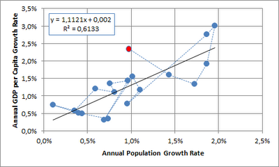
Next, I looked at GDP per capita growth relative to population growth. Given that GDP per capita has already eliminated the population element, I would have expected independence between the two time series. This doesn't seem to be the case (each point on the graph represents a decade, the 2000's are shown in red):


I would offer the following non-exclusive choice of alternative explanations:
  • the data is flawed
  • the is no causality
  • the relationship has broken down (or possibly reversed as shown by the last three data points) as a larger share of the world population has obtained middle income status
  • population growth is dependent on gdp per capita growth with a lag (and the lag is masked when looking at decadal data)
  • most worringly when looking at the future potential for GDP per capita growth, GDP per capita growth is indeed dependent on population growth

When looking at the annual time series since 1950, indeed it seems that there is no correlation (2008 shown in red), although this also doesn't necessarily imply that there is no causality:


Data is here.

Friday, May 25, 2012

Peak Copper

Since copper prices have increased massively starting in 2004, copper peak theories have been suggested.

Although copper is essentially the ultimate renewable resource (and also available quite abundantly in lower grades) the discussion has gained some traction especially following Jean Laherrrère's slide collection, which was reproduced here and  here.

The following provides an update of the Hubbert linearization with data extended to 2011 (based on Hubbert's original 1956 paper on fossil fuels and a Hubbert math summary) and a naive top-down estimate of Qtot.


Based on the above Qmax end up being 4.7 billion tons (whereof approx. 0.6 billion tons have been mined as of 2011). USGS noted the following on world copper resources:
"A 1998 USGS assessment estimated 550 million tons of copper contained in identified and undiscovered resources in the United States. Subsequent USGS reports estimated 1.3 billion tons and 196 million  tons of copper in the Andes Mountains of South America and in Mexico, respectively, contained in identified, mined, and undiscovered resources. A preliminary assessment indicates that global land-based resources exceed 3 billion tons. Deep-sea nodules and submarine massive sulfides are unconventional copper resources."
Reserves are estimated at 0.55 billion tons. Note below reserve and resource definitions from USGS.
"Reserve: That part of an identified resource that meets specified minimum physical and chemical criteria related to current mining and production practices, including those for grade, quality, thickness, and depth."
"Resource: A concentration of naturally occurring solid, liquid, or gaseous material in or on the Earth’s crust in such form and amount that economic extraction of a commodity from the concentration is currently or potentially feasible."
Although copper production data doesn't really lend itself to Hubbert linearization, the Qmax of 4.7 billion tons is broadly in line with USGS's resource estimate (which excludes already mined mineral).

There have been suggestions to use alternative periods for the fit of Hubbert linearization. Results are summarized below:


It seems that the year of peak primary production is somewhere between 2030 and 2070, probably after 2050. From this perspective (admittedly a somewhat naive view from 10'000 m altitude), it would seem that the peak copper narrative is not so relevant.

We aim to address two aspects providing additional support to the above from separate angles in future posts:

  • Relative prices of energy and copper (energy as a key input factor to copper production cost and copper as a key input factor for renewable energy production cost)
  • Recycling / secondary production

Thursday, May 10, 2012

World Population Data 1820 - 2008

I have now expanded the the GGDC/Maddison dataset filling the missing datapoints using the same growth pattern as neighboring countries. Obviously this exercise should be taken with a grain of salt as the additional data points are not based on original research.

Population (in 000) and decadal population growth for Western Europe, Western Offshoots, Eastern Europe & FSU and Latin America.


Population (in 000) and decadal population growth for China/Hong Komg/Taiwan, Pakistan/India/Bangladesh, Rest of Asia and Africa.


Source data is here.

Wednesday, April 25, 2012

Correlation between Copper and Chilean Peso (3)

Happy to provide the missing piece of the additional analysis requested by a reader.


Calculated correlation based on monthly, quarterly and yearly time series using 12 months, 10 quarters and 5 years on a rolling basis. Plotted below against copper market share of exports.


Following conclusions can be drawn:
  • For shorter time intervals you get more noise, but an a yearly basis you get very high correlation (i.e. low correlation coefficient smaller than -80%)
  • There seem to be periods with high correlation regimes (1992-1998, 2003 to present)
  • Correlation breaks-down in 1989-2991 and 1999-2002

Tuesday, April 10, 2012

Correlation between Copper and Chilean Peso (2)

Taking up a reader comment, I have updated the export data back to 1989. I have also eliminated the data from the free economic zone as they tend to be re-exports, so overall data for 1996-2010 might look slightly differently. Clearly from 1989 to 1993 the dependency on copper has been reduced from 50% to 35%. After 2003 dependency increased again to a level of almost 60%.


Other mining can be decomposed as follows (values for 2010 in USD million). Molybdenum and gold are generally by-products of copper mining. Lithium's importance is much lower than widely assumed.


Answering the question of the commodity nature of the "other" export is not straight forward, although both the agro and more importantly industrial segments could be classified to a significant extent as commodity based with lower value addition:

Agro is mostly fruit and represents 6.3% of total exports.
Industrial is more diversified and represents 28.4% of exports. Within the industrial bucket the largest contributors are cellulose (12.3% of industrial), salmon (10.2%), wine (7.9%), wood (6.8%), fish meal (2.6%), copper wire (2.4%) and transport material (2.1%).

Will follow-up with a separate post with the development of R2 and beta based on monthly data points.

Sunday, March 25, 2012

Copper Volume Forecasting

Similar to our review of Cochilco's price forecasts, we decided to look at copper production forecasts by ICSG. Given that ICSG and Cochilco are relatively transparent organization and make their respective forecasts available to the public domain, such reviews may be viewed as somewhat unfair. However, we do understand the challenges of forecasting and are certainly not claiming that we would do better.

The following graph plots the development for forecast world copper production volume as a percentage of the ultimate or last available production volume for the calendar years 2005 to 2011. Reading example: On 28 April 2006 (1.67 years before the end of calendar year 2007), ICSG forecasted a production volume 16'296 million tons for 2007, while the actual production volume was 15'483 millions tons (as reported on 30 April 2012). The initial forecast is 5.4% higher than the final value (depicted as a large green triangle at <-1.67, 5.4%>).


Clearly production volumes have been systematically overestimated. This is interesting because the same asymmetric forecast development is not found for surplus/deficit numbers of refined copper, although the numbers for 2007 and 2010 saw large movements from a forecasted surplus to a realized deficit of refined copper.


Saturday, March 10, 2012

Correlation between Copper and Chilean Peso (1)

In September 2009, the Chilean National Bank (Banco Central de Chile) provided a good summary of the dependency of the Chilean economy on copper exports

The main theme of the presentation is that while copper continues to be very important, the growth of non-copper exports have gained higher importance and that Chile has managed its natural resource curse successfully.

The latter is probably true, but because of elevated copper prices for the last couple of years the copper exports as a percentage of total export have actually increased and now stood at 55% in 2011 (data source 1996-2010, 2011 own estimates, note that manufactured copper products like copper wire are included under 'Other').


This is reflected in higher correlation between Copper and Chilean Peso (CLP) in most recent years (2001-2011 compared to 1990-2000). R2 has increased from 41% to 69%, the absolute value of beta has increased from 13% to 24% (reading example: a 10% increase in Copper prices leads to a 2.4% strengthening of the CLP [CLPUSD decreasing]).